Project
Bestea
Brief
The brief asked for the branding and packaging design for a company in the fast-moving consumer goods category.
Within the ready-to-drink (RTD) tea industry, the challenge was to create an identity and a design that would break out of the mold of the minimalism-driven, heritage-based products of the established market and attract a health-conscious but youthful target market who enjoy iced tea but dislike the current product offering.
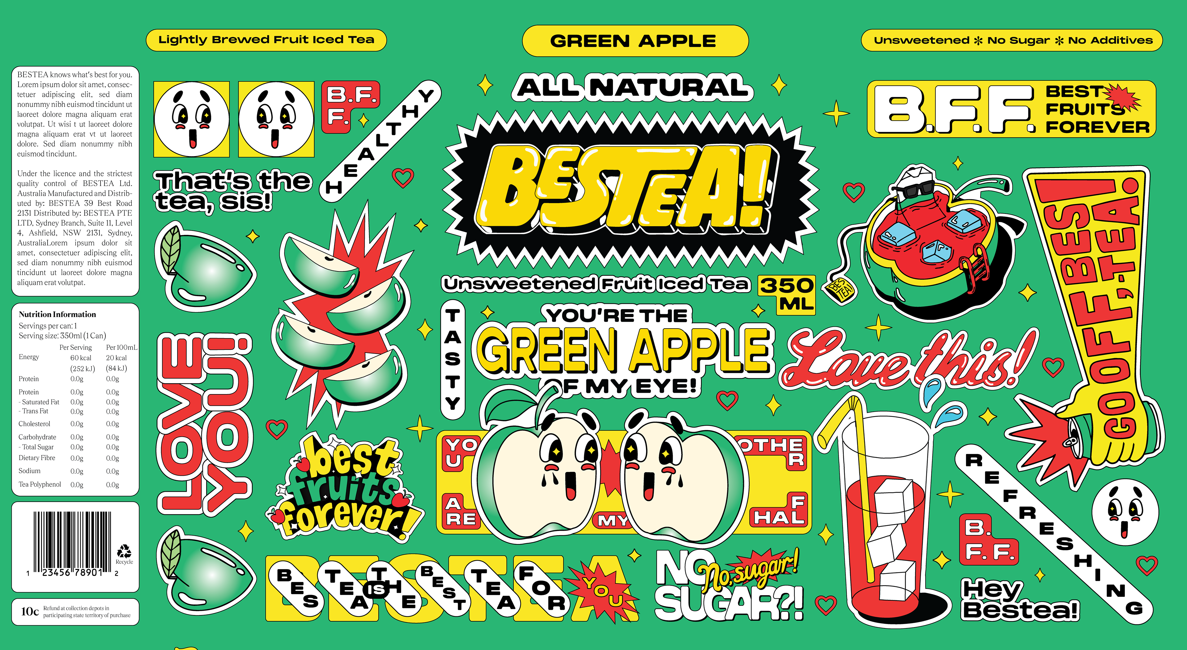
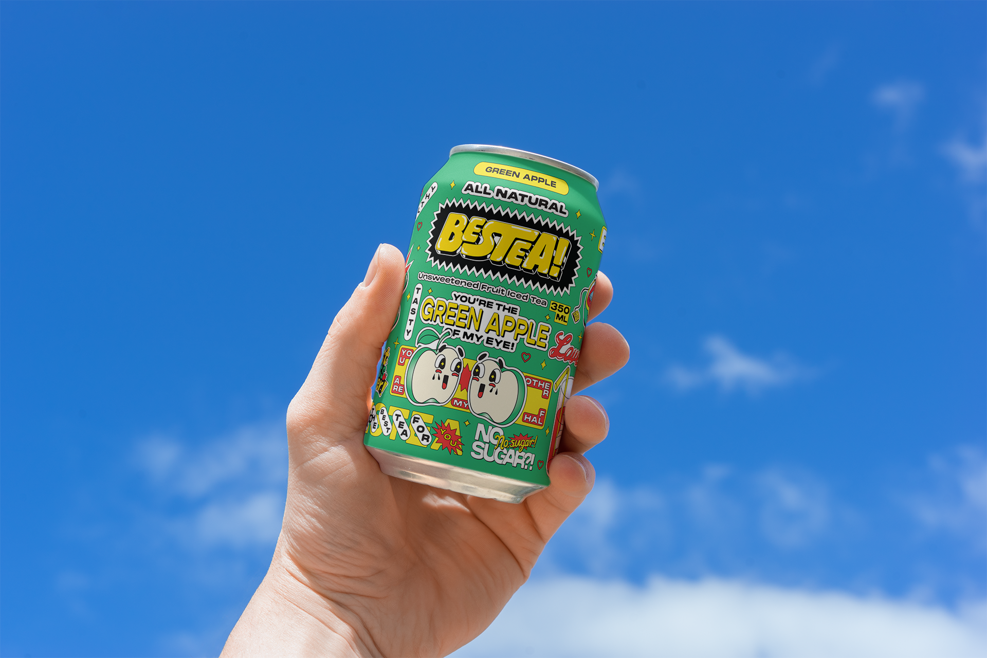
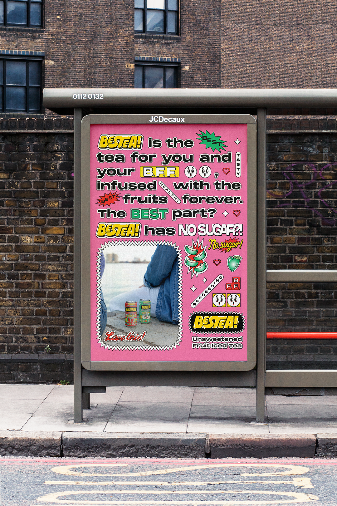
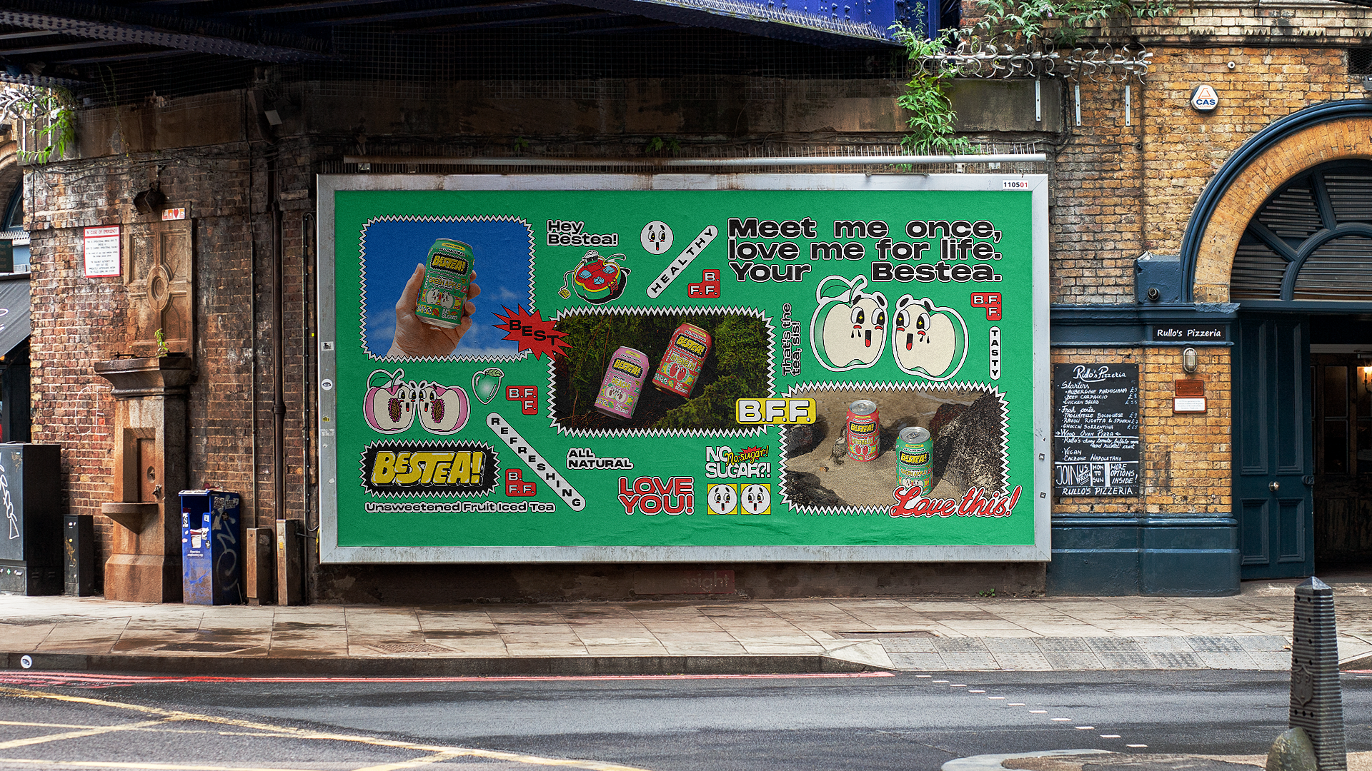
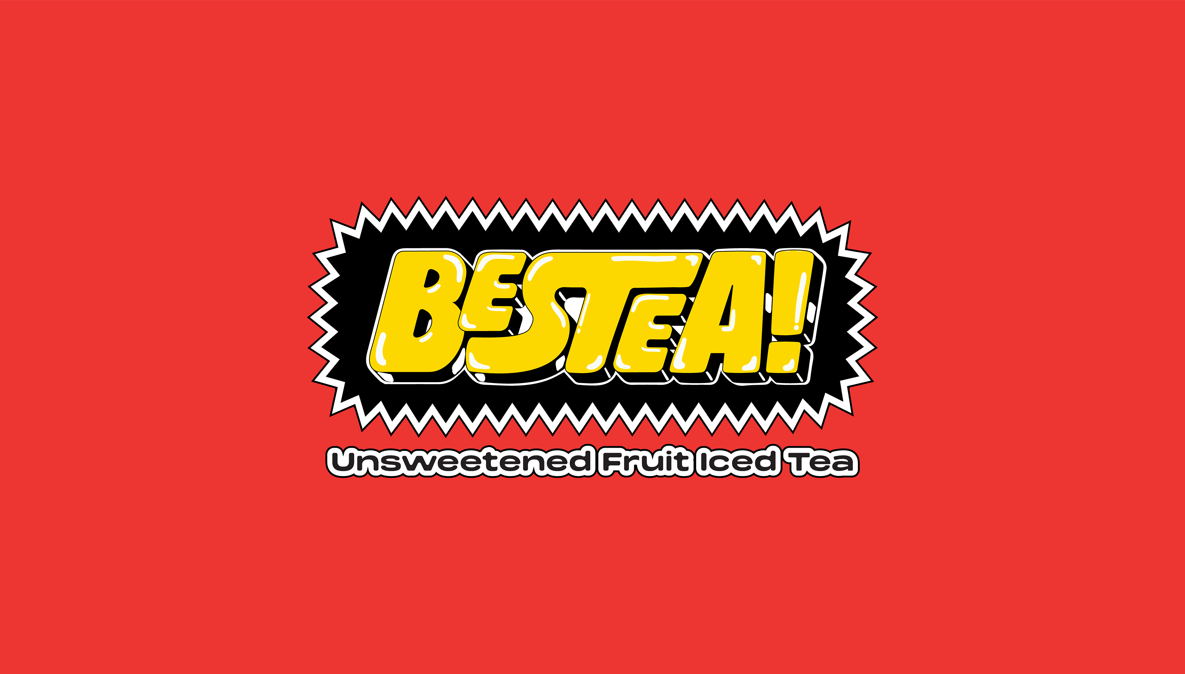
I decided to create Bestea, a brand for an unsweetened fruit iced tea product based on the idea of a drink who is as weird, quirky, playful, but wholesome, as your bestie - your Bestea.
I decided to create Bestea, a brand for an unsweetened fruit iced tea product based on the idea of a drink who is as weird, quirky, playful, but wholesome, as your bestie - your Bestea.
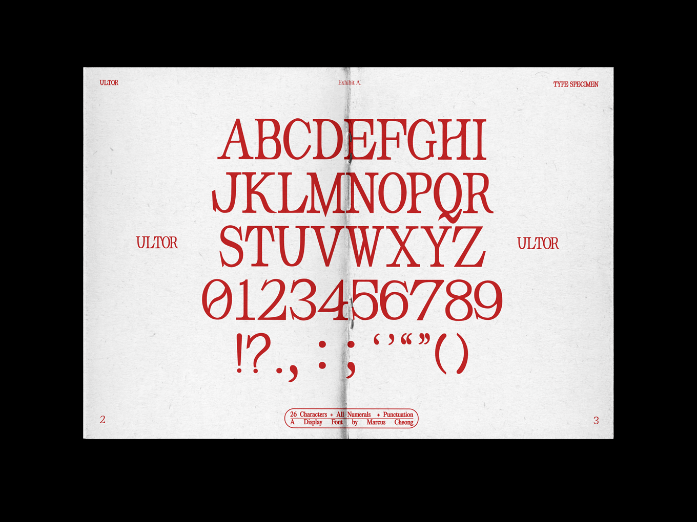
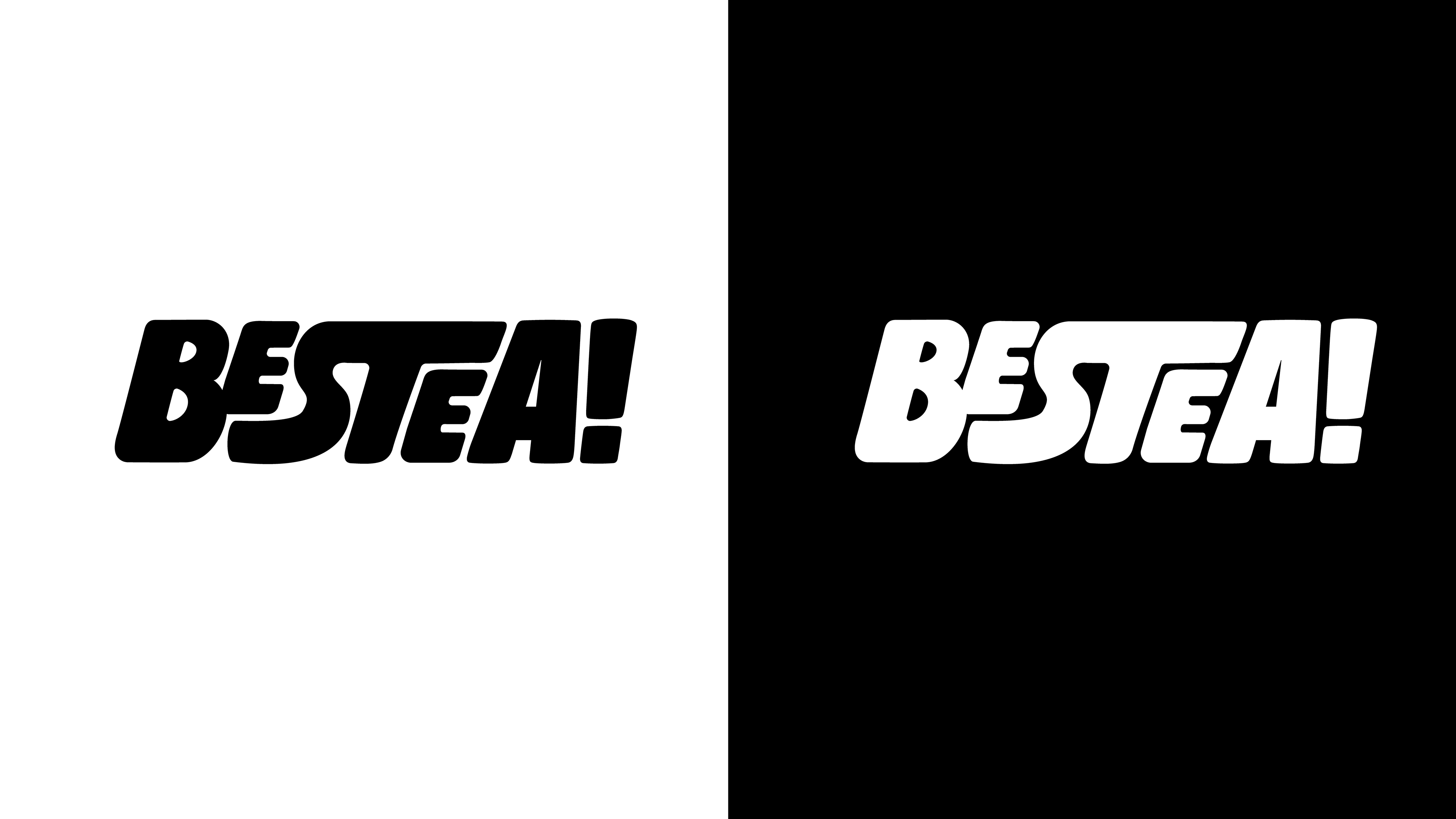
Wordmark Development
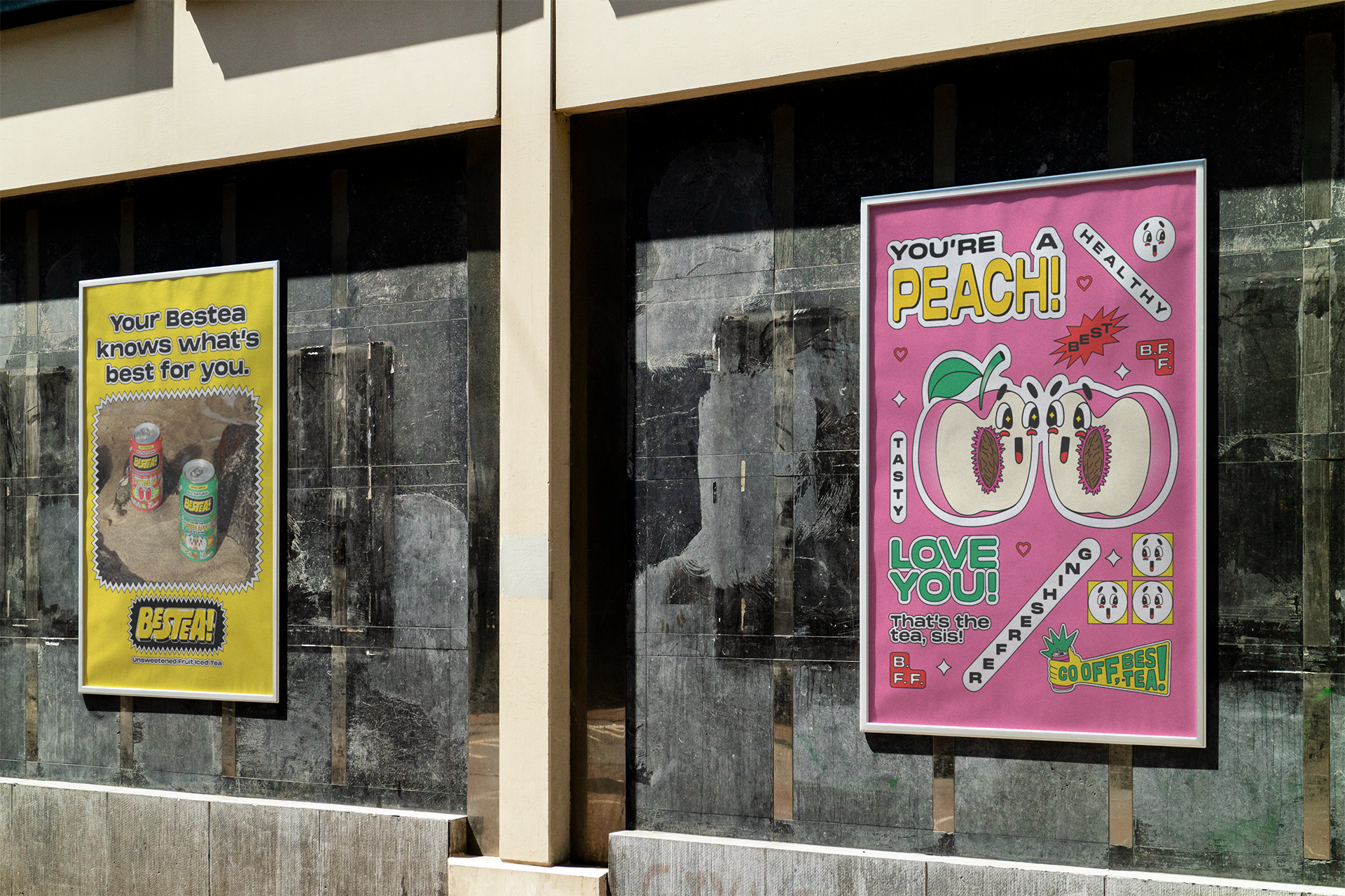
A simple hand-drawn wordmark was created to express Bestea's loud yet friendly feel. The goal was to create a bold and eye-catching wordmark that would also not feel out of place with the many different graphic devices that would be created to accompany it.
Illustrations
In order to contrast the photography-driven imagery of incumbent Australian brands like Lipton, Fuze Tea and The Real Iced Tea Co., I decided that illustrations would form the core of the brand, enabling its playful and personality-rich nature to be fully expressed.
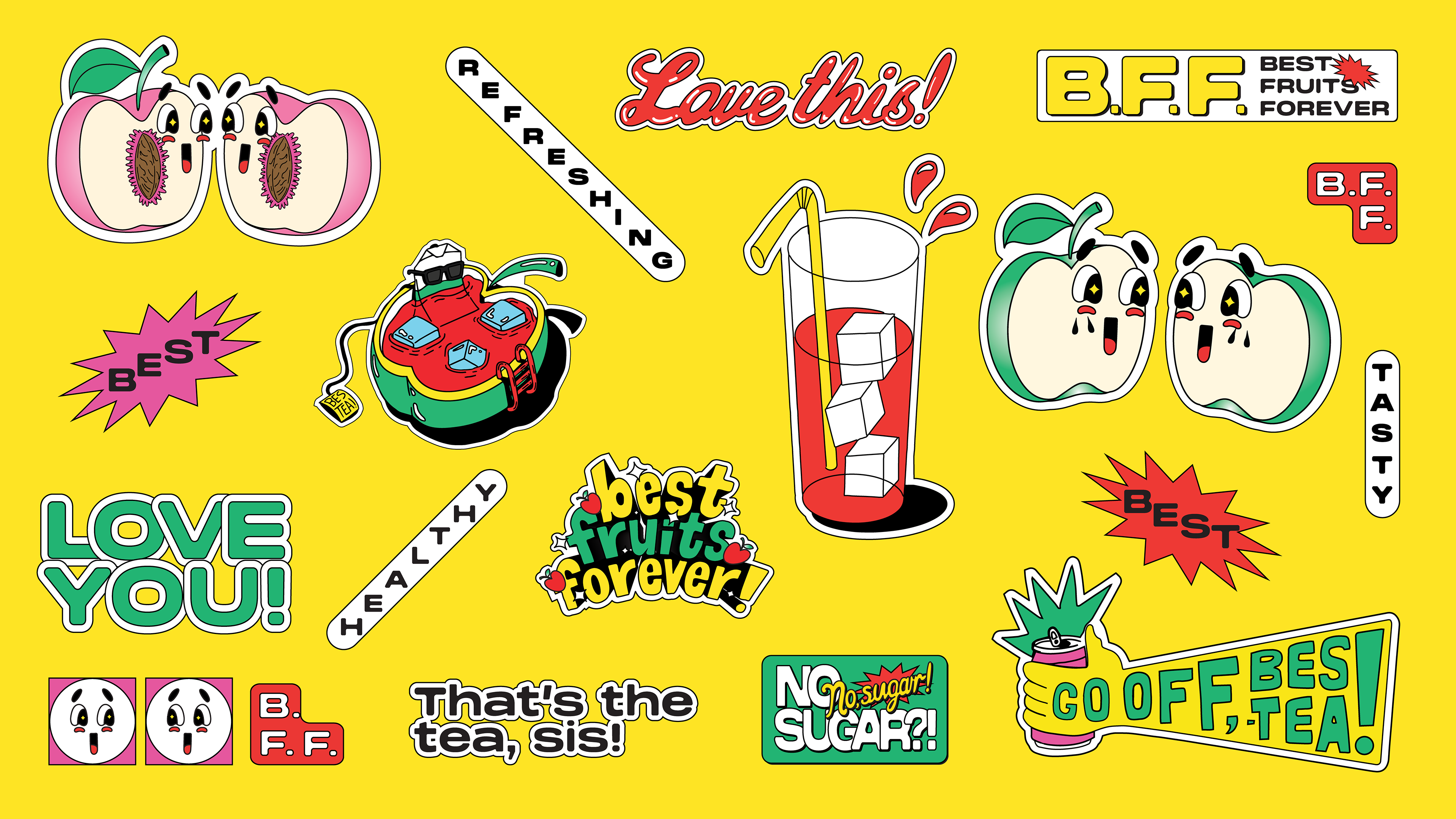
Flavours & Mascots
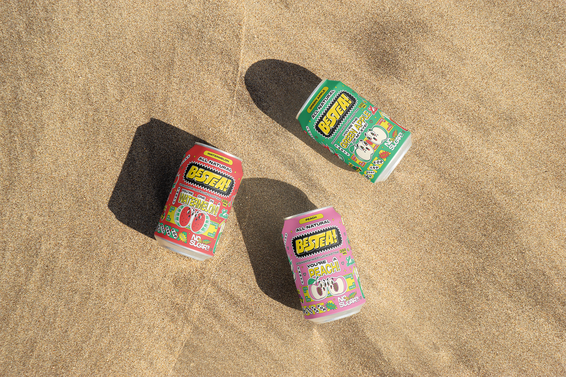
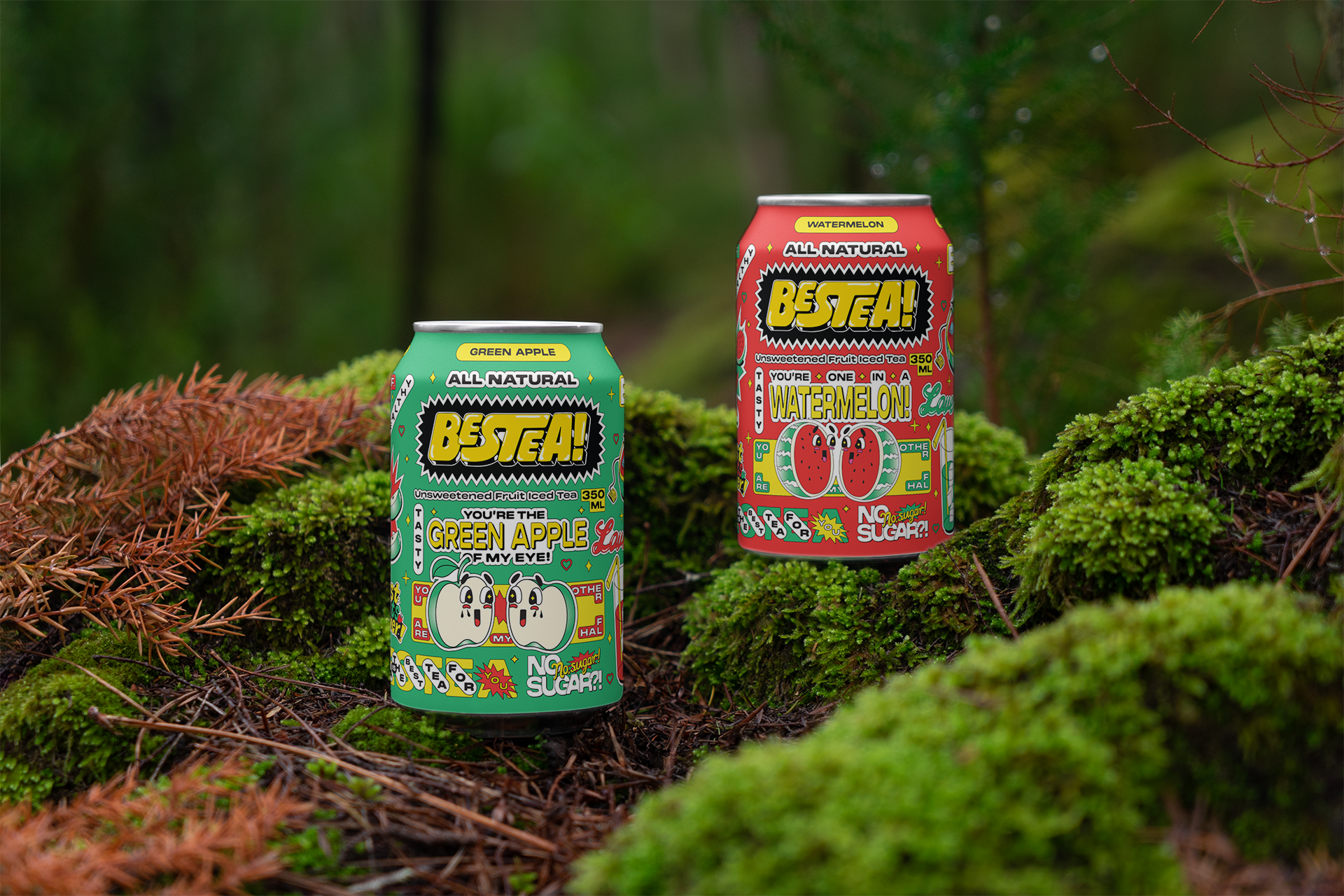
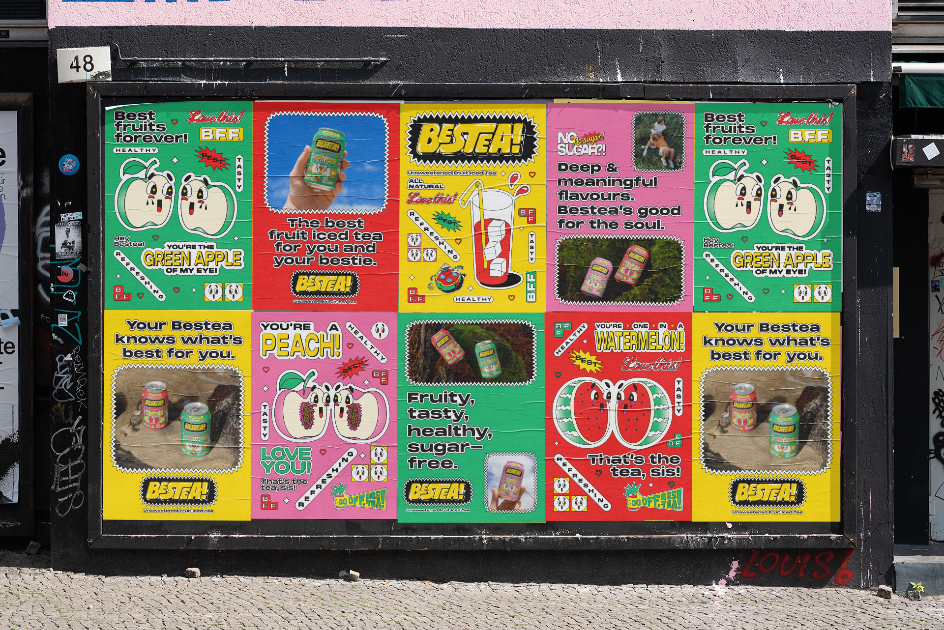
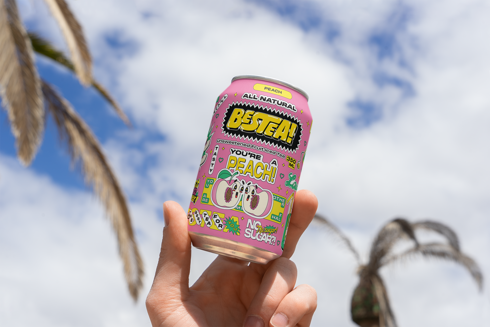
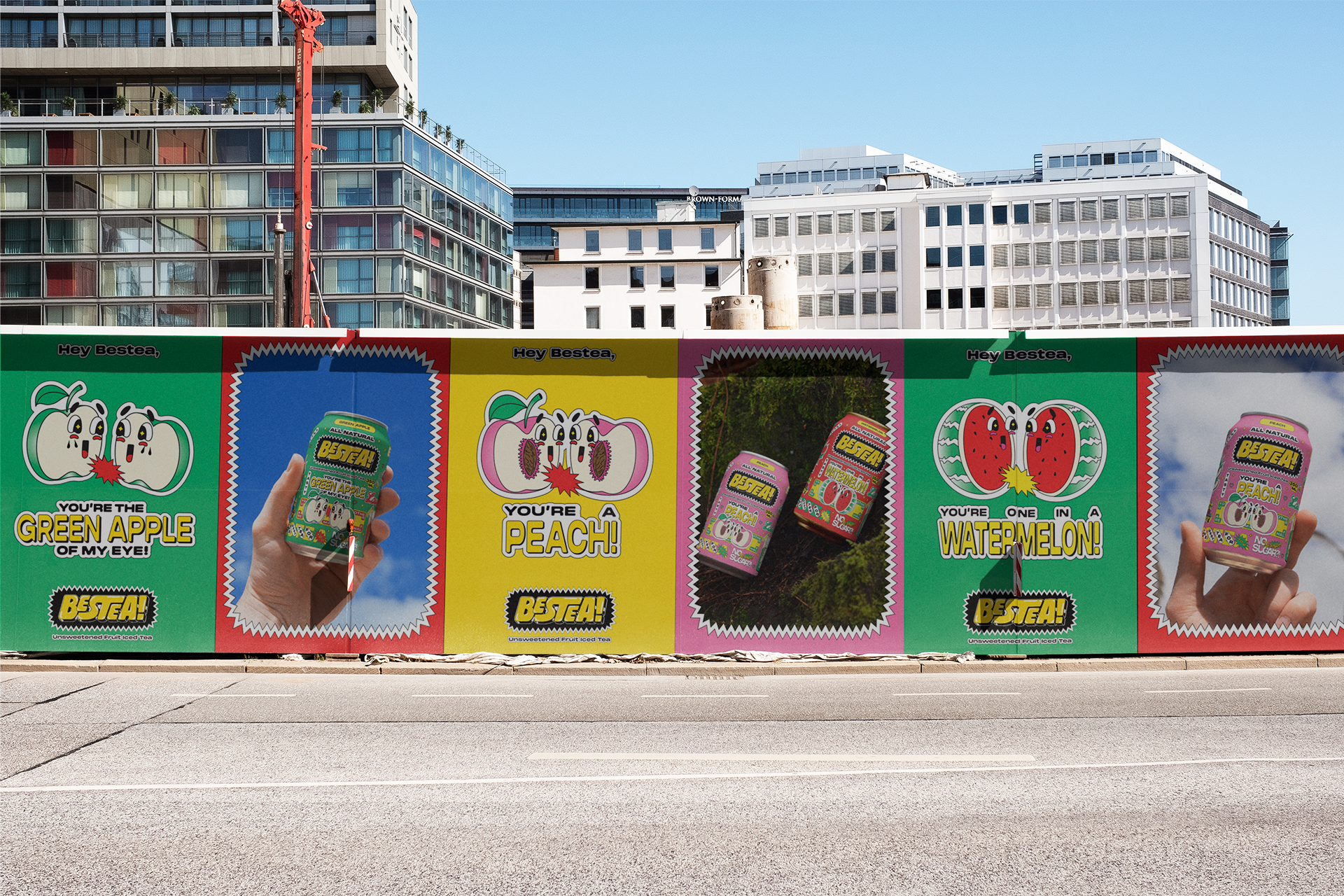
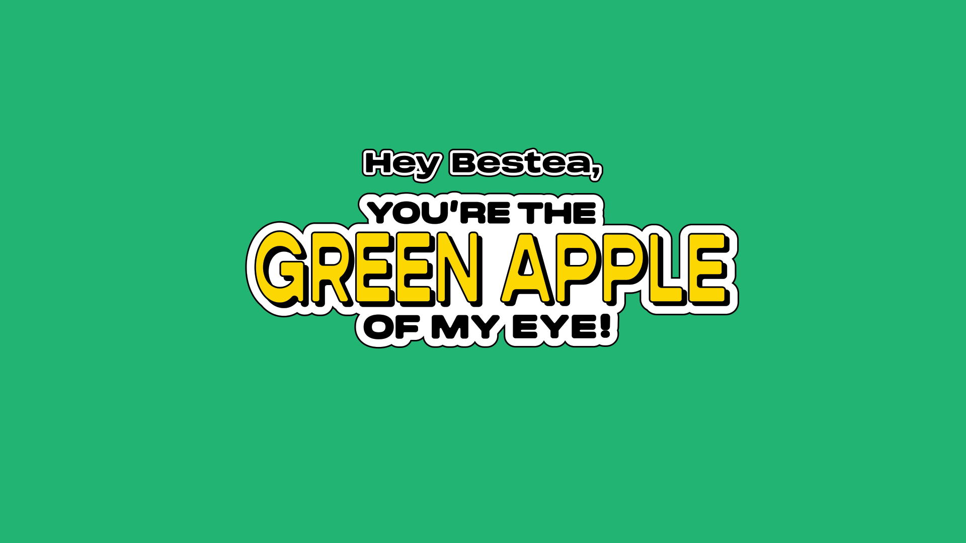
The Bestea mascot is a pair of two fruit halves for whom they are the bestie / the "other half" for each other, looking upon one another with adoration. True to the wholesome nature of a best friendship, the names of the flavours of Peach, Green Apple and Watermelon are compliments, to be paid to your b̶e̶s̶t̶i̶e̶ Bestea.
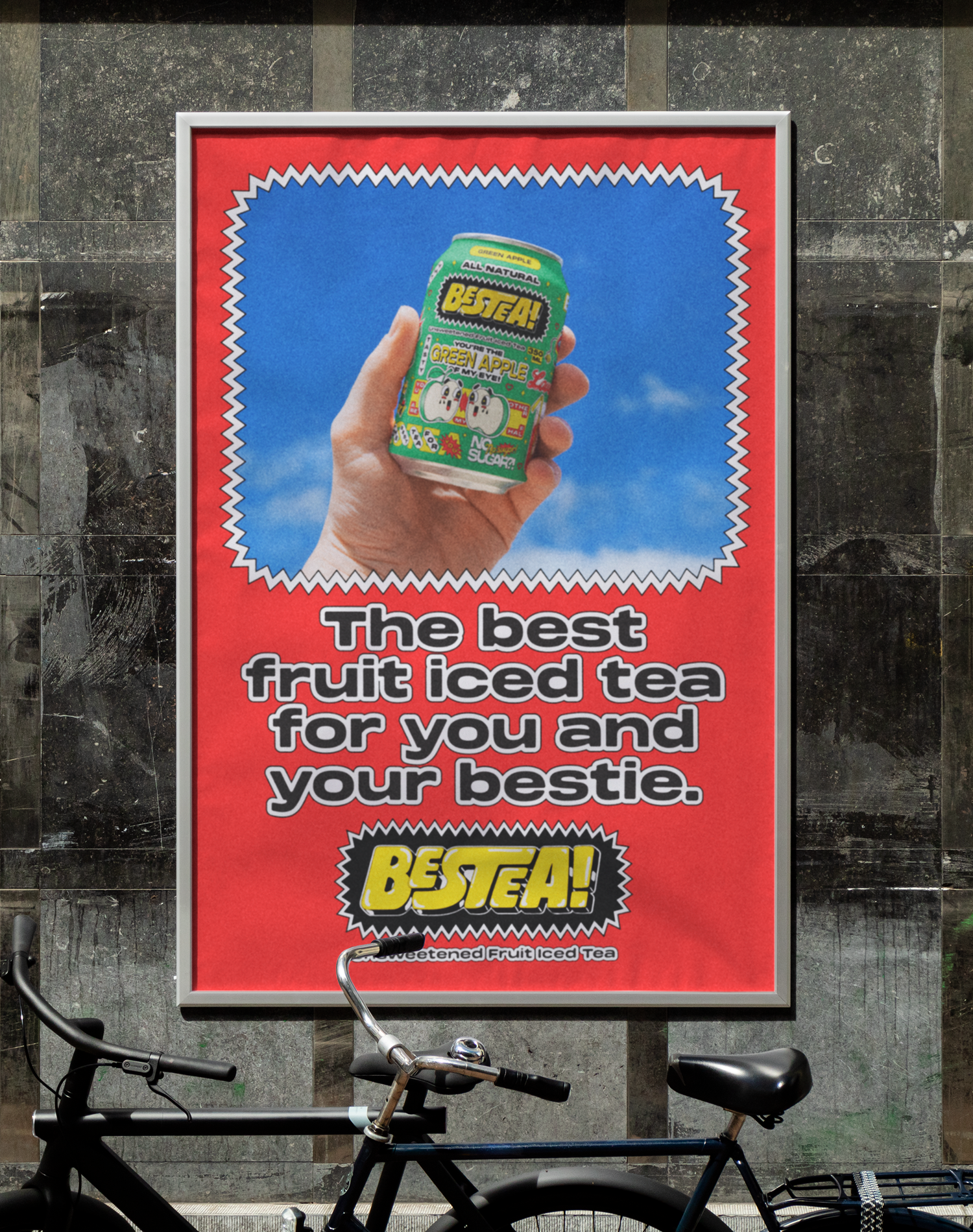
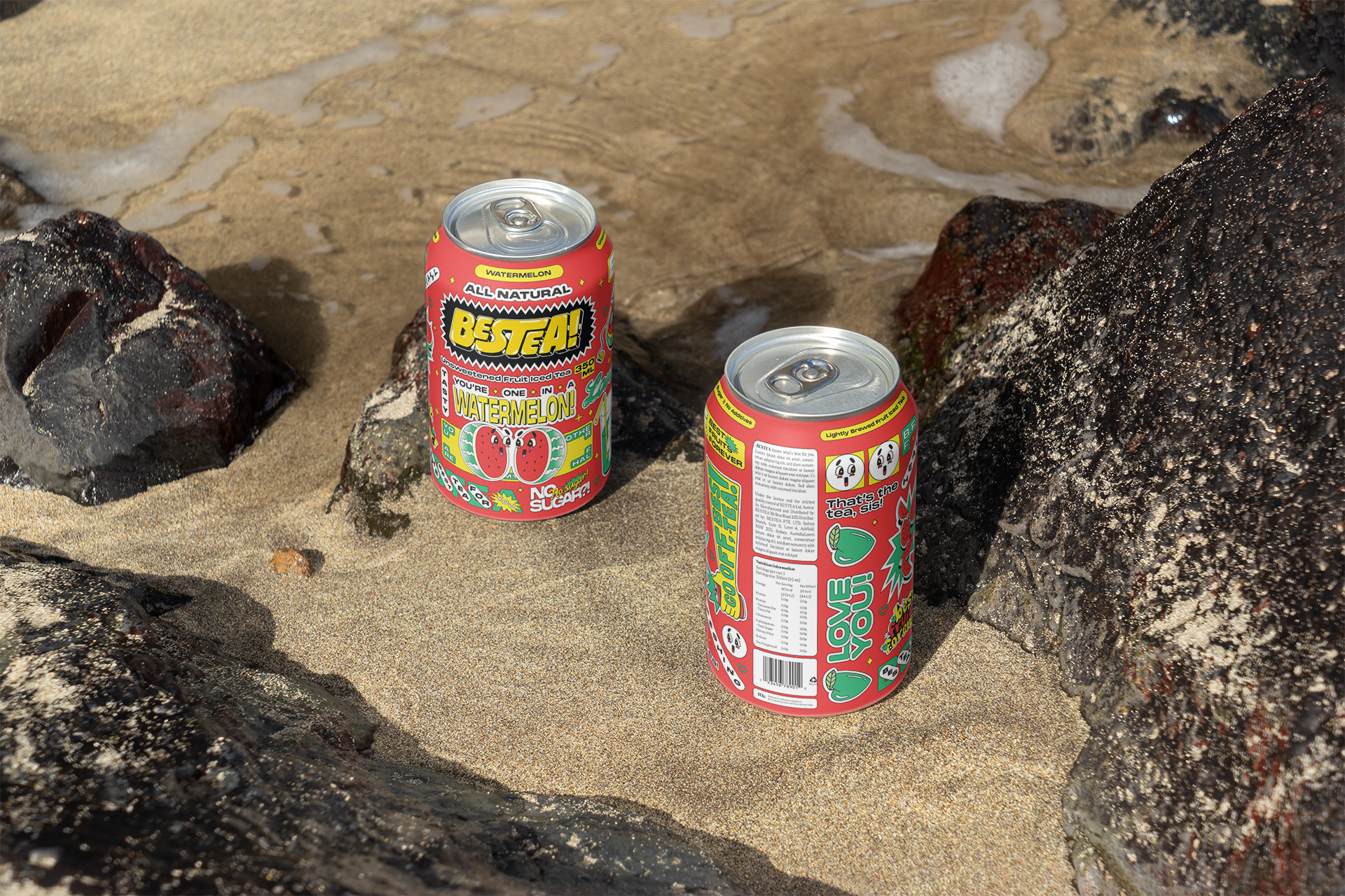
Can Design
Bestea sticks out like a sore thumb on the supermarket iced tea shelf. Just like your bestie, Bestea is loud, weird, quirky, playful on the outside, but is wholesome on the inside, and has unsweetened and subtle flavours that contrast with the cloying offering of products like Lipton Iced Tea and Fuze Tea.